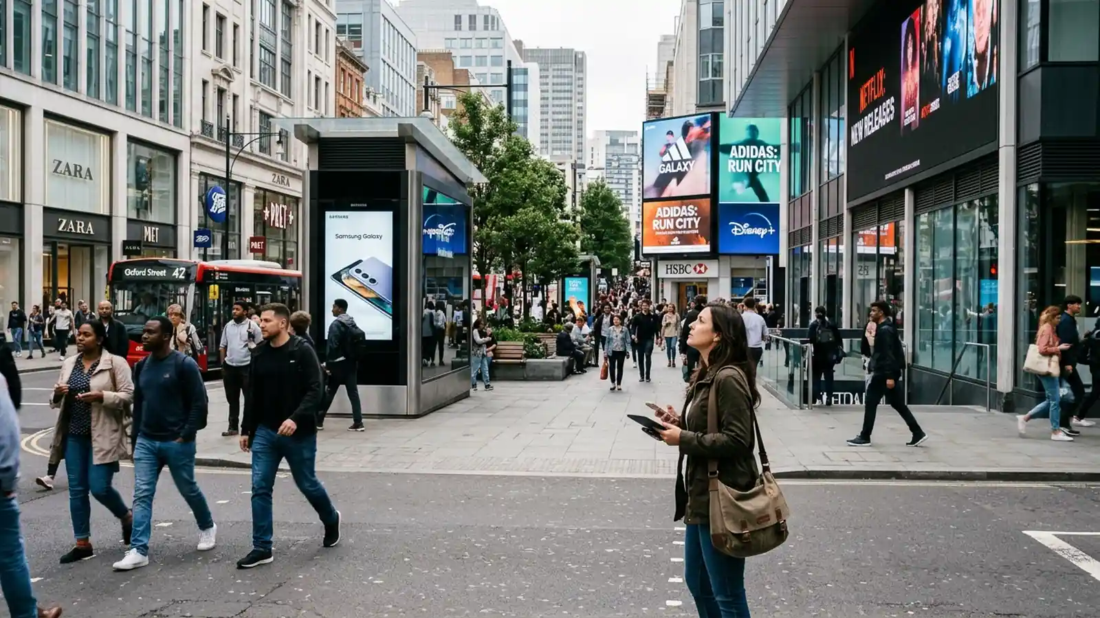


Most digital out-of-home campaigns that underperform have a creative problem, not a media problem. A banner designed for a laptop gets placed on a vertical transit screen, a long headline is cropped, or a product shot is too small to read from the sidewalk. Screens in public places are seen briefly, from a distance and while people are doing something else.
In short: DOOH creative has to match each screen's size, orientation, file requirements and viewing time. Specifications vary a great deal between networks and even between screens within one network, so the right approach is to collect the spec sheet for every screen group before design starts, then build a small family of layouts around a single idea that reads in a few seconds. This guide covers the formats, dwell time, design rules and dynamic creative that matter most.
1Why DOOH Specs Vary So Much
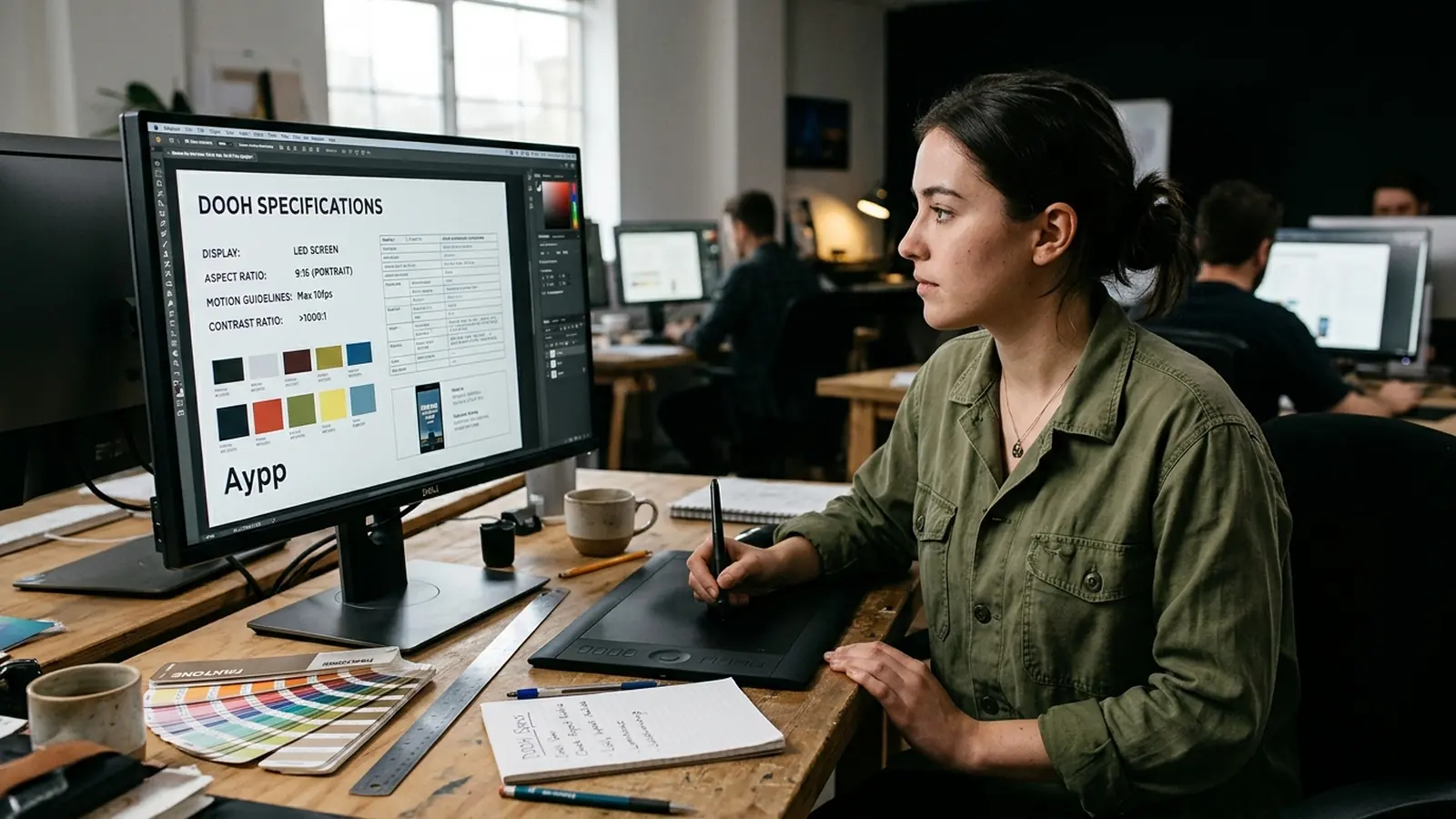
Online display has a short list of standard banner sizes. DOOH does not. Screens are made by different manufacturers, installed in different shapes, and built into everything from bus shelters to elevator panels. A media owner will publish the resolution, aspect ratio, accepted file types and maximum file size for each of its screen types, and those requirements can differ from the next owner's.
Some screens are landscape, some are portrait and some are unusual shapes such as very wide strips or tall columns. Some play static images, others play video, and others accept both. Your supply-side platform or media owner will list what each inventory line needs, and it is the media owner's sheet that counts, not a general rule. Resolution figures you may see quoted elsewhere are examples only and should always be checked against the current sheet for the screens you are buying.
2Common Formats and What They Are Used For
Rather than memorizing sizes, it is more useful to understand the families of screens and what each is good at.
| Screen type | Typical orientation | Viewing situation | Creative approach |
|---|---|---|---|
| Roadside and large format | Landscape, often very wide | Seen from moving vehicles at distance | Very few words, bold brand, one image |
| Transit shelters and street furniture | Portrait | Pedestrians and people waiting, close range | Clear headline, product shot, simple call to action |
| Airports and stations | Mixed, often large video walls | Long waits, mixed attention | Room for motion and short storytelling |
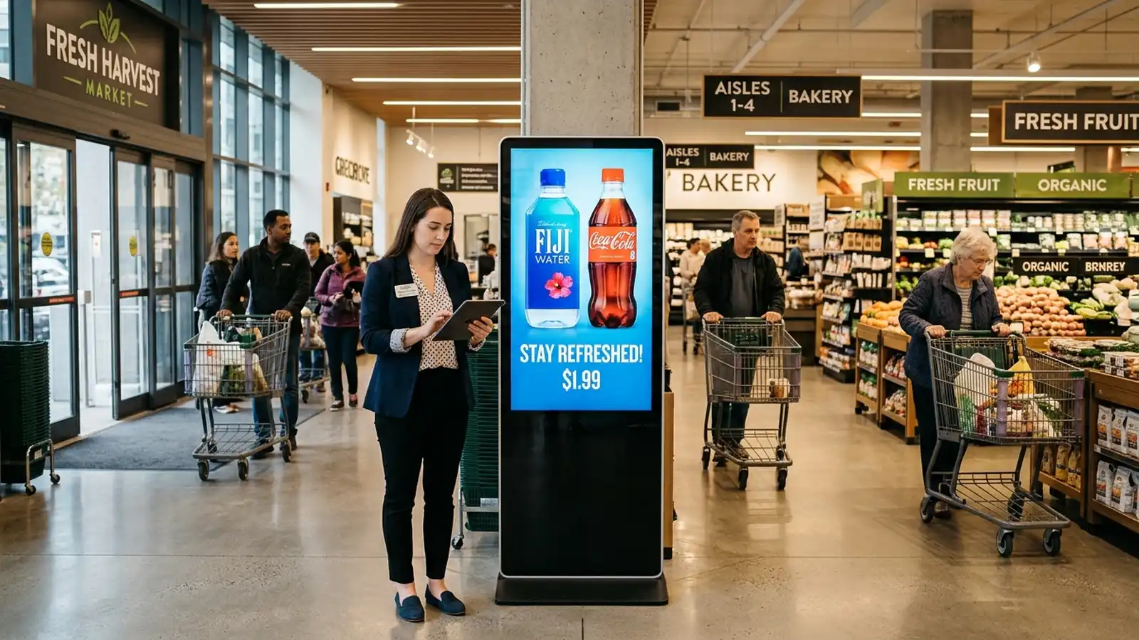
| Malls and retail venues | Mostly portrait | Shoppers near purchase decisions | Offer or product focus, store cues |
| Elevators and office lobbies | Small portrait or landscape panels | Captive, short standing time | Compact message, readable at small size |
| Taxis and rideshare | Small screens inside or on vehicle tops | Varies by position, indoor viewing can be longer | Match message to indoor or outdoor placement |
Resolution and aspect ratio vary by screen, so a generic example such as a standard widescreen or portrait frame should be treated as a starting point for concepts, never as a final production size.
3Dwell Time: Designing for Seconds, Not Minutes
Dwell time is how long a person is likely to be in a position to see the screen. At the roadside it is a glance. At a bus stop it may be a minute or more. In an airport gate area it can be much longer, but attention is shared with phones, announcements and luggage.
Separate from dwell time is spot length, which is how long your ad stays on the screen each time it plays. Networks set their own spot lengths and loop structures, and a single loop shows several advertisers in sequence. Your creative needs to deliver its point within the spot, and ideally within the first moments of it. If a person only catches the middle of your ad, they should still understand who it is for and what it offers.
A useful working rule: decide how long a typical viewer will look, then design for half of that. If your message needs a sequence of five scenes to land, it is probably a video ad that belongs in a different channel.
Placement inside the venue matters too. A screen at eye level next to a checkout is viewed from arm's length, while one mounted high on a wall is seen from across a hall. Ask the media owner for photographs or a site description for each screen group, so the design team can judge reading distance instead of guessing.
4Design Rules That Hold Up Across Screens
- One idea per ad. A single message with a single call to action. Two offers on one screen usually means neither is remembered.
- Few words. Aim for a short headline and let the image carry the rest. If you cannot read it aloud in one breath, shorten it.
- Large type with strong contrast. Screens are viewed in daylight, glare and evening dark. Thin fonts and pale text on a busy photo fail quickly.
- Brand early. The logo and product should be visible from the first moment, not saved for a closing frame that many viewers will miss.
- Respect safe areas. Some screens crop, frame or overlay content at the edges. Keep key text and logos away from the borders, as the spec sheet advises.
- Plan for motion carefully. Movement attracts the eye, but fast cuts and small animated text are hard to read. Let one element move at a time.
- Avoid QR codes and long URLs unless the dwell time supports them. At the roadside they cannot be used. At a transit stop or in a venue, they can work if they are large and clear.
Test creative on an actual screen, or a mock-up at realistic distance, before the flight. A design that looks excellent on a monitor can fail at ten feet.
Sound is another variable. Most public screens play without audio, or with audio that people will not hear over the surrounding noise, so a message that depends on a voiceover will not land. Where audio is allowed, treat it as a bonus and make sure the visuals tell the whole story, including the offer and the brand name.
5Dynamic Creative and Triggered Variants
One of the practical advantages of programmatic buying is that the creative can change with context. Dynamic creative uses a template with fields that update automatically, such as the nearest store address, the local temperature, the time until an event, or a live offer. Triggered variants swap a different version in when a condition is met.
For example, a retailer might show the same layout in every market but update the nearest store name for each screen group. A drinks brand might switch to a hot or cold product image depending on the weather. These setups save a lot of production time once the template is approved, but they depend on reliable data feeds and clear fallback creative for the moments when a feed fails.
Because every variant is a separate asset that has to pass approval, build a version matrix early: which screen groups, which languages, which triggers. Keeping that matrix tidy is a trafficking job as much as a design job, and it is covered in our guide to the pDOOH buying workflow.
6Approvals, File Handling and Trafficking
After design comes the part that causes most last-minute delays. Media owners review creative for content rules, technical quality and category restrictions, and some venues have their own policies on what can be shown. Approval windows differ by network, so check the lead time before you commit to a start date.
Typical problems include the wrong file type, a video that exceeds the allowed file size, a frame rate the screen does not support, missing audio rules and creative with mislabeled sizes. A simple naming convention that includes screen group, size and version number prevents most mix-ups. Trafficking also means confirming that each creative is attached to the correct deal or line before launch, and checking proof-of-play data afterward to confirm that what ran matches what was approved.
If your team produces creative in volume across several markets, our creative operations and campaign management and trafficking services handle the versioning, checks and uploads. For the wider service, see programmatic DOOH advertising.
Accessibility is worth a short check as well. High contrast, large type and a clear reading order help everyone, including people with low vision and people passing quickly. Avoid relying on color alone to carry meaning, and avoid flashing effects that could cause discomfort.
Finally, keep a record of what worked. After each flight, note which layouts, headline lengths and screen groups held up best, and feed that into the next brief. Over a few campaigns this becomes a house style for screens that saves time and reduces rework, and it gives new team members and partners a clear starting point.
7A Pre-Flight Creative Checklist
- Have you collected the current spec sheet for every screen group in the plan?
- Does each layout match the correct orientation and aspect ratio?
- Is the message readable in the shortest likely viewing time?
- Are logo, product and call to action inside the safe area?
- Has every dynamic field been tested with real and missing data?
- Is there fallback creative for each trigger?
- Have approvals been confirmed with enough lead time?
- Are files named and mapped to the right deals?
If you are new to the channel, start with our plain-language explainer, what is programmatic DOOH, and then use this list on your first plan.